
Ballarat _ Destination Identity

An unexpected brand inspired by the region’s unique character.
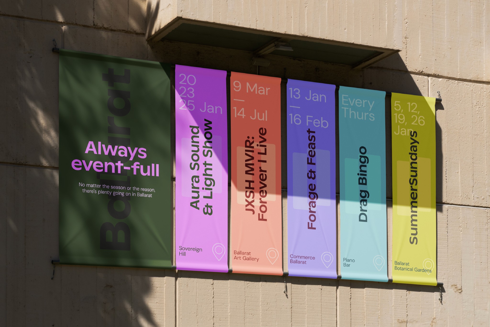
For years, Ballarat has been seen as ‘old, gold, and cold’. Brilliantly Unexpected is a bold new brand positioning, identity, and campaign platform designed to reframe how people view Victoria’s largest inland city. Rooted in truth, the brand celebrates the many contrasts and contradictions that define Ballarat — where the past and present, tradition and creativity always seem to collide in unexpected and harmonious ways.

Direction
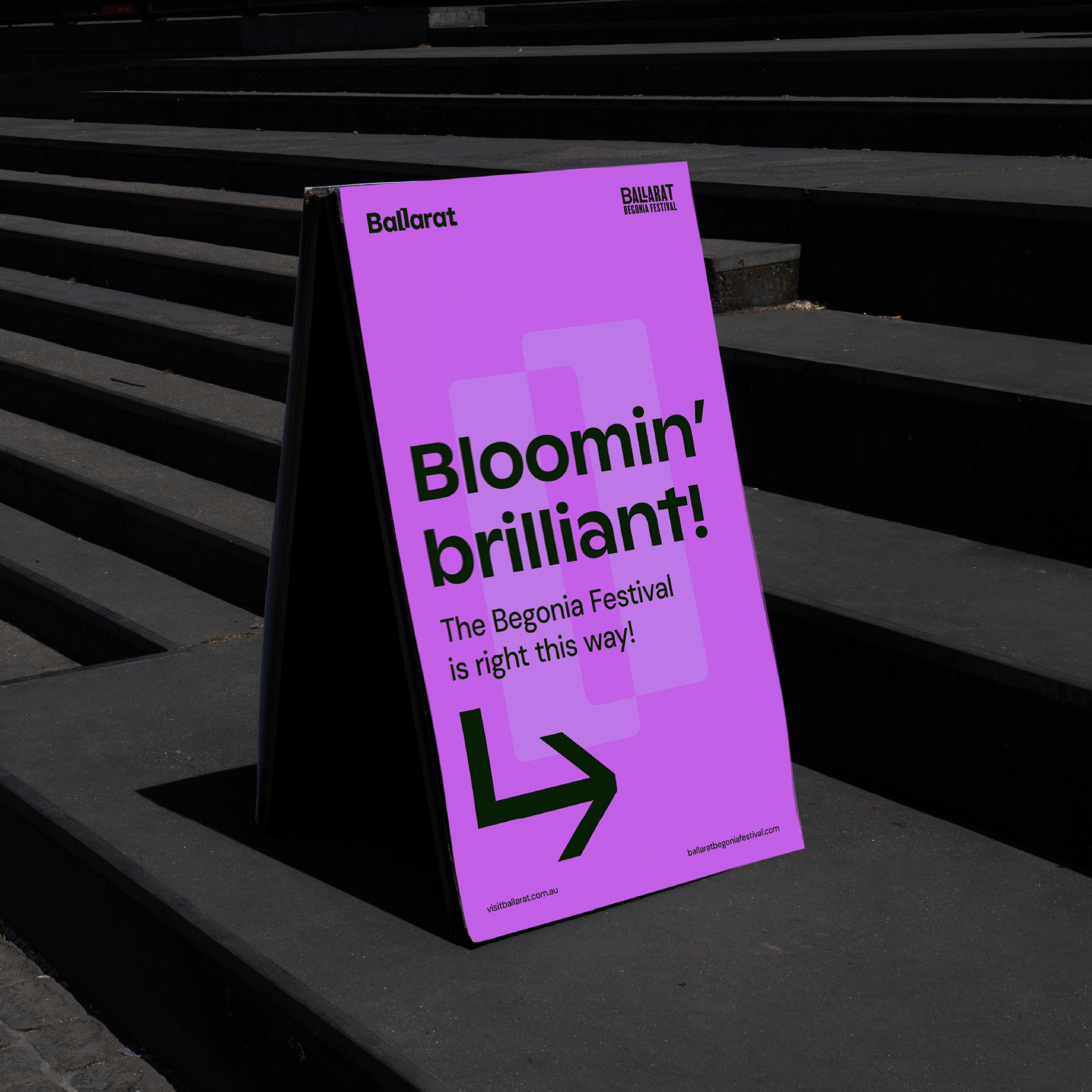
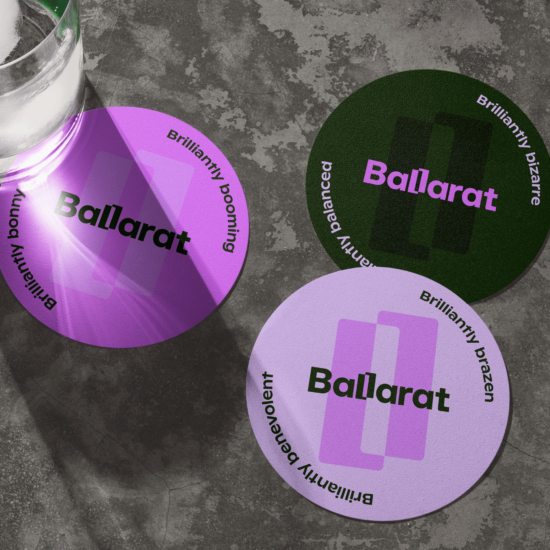
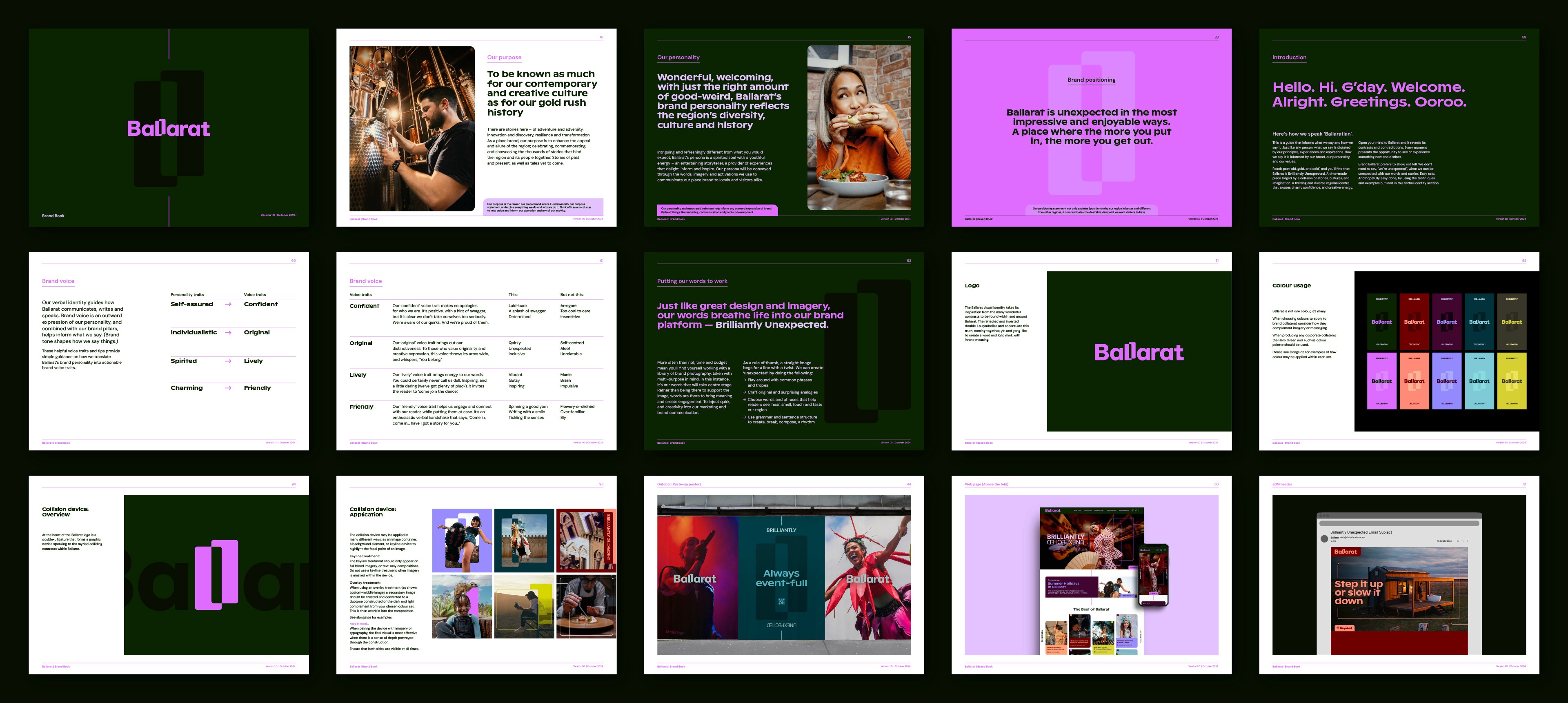
The vibrant and uniquely Ballarat identity embodies the many ‘Brilliantly Unexpected’ experiences the region offers. At the heart of the identity system are Ballarat’s inherent contradictions, reflected in the wordmark’s two contrasting Ls, which form a distinctive device flowing through the entire visual identity system. The Ballarat colour palette reflects the abundance of contrasts and diversity in the region, while the verbal identity celebrates the original and lively ‘Ballaratian’ personality, giving a voice to the Brilliantly Unexpected brand platform.

“The ‘Brilliantly Unexpected’ brand platform and new identity truly highlight our region’s distinct essence and personality. At every step, the team has stayed true to the vision, ensuring our brand platform is as distinctive and compelling as the people and places it represents.”
John Pandazopoulos _ Tourism Midwest Victoria – Chair


Project Details
Client
Tourism Mid-West
Project
Rebrand / Destination Identity
Sectors
Destination Marketing + Tourism + Local Government
Services
Logo Creation / Brand Identity / Brand Guidelines
Collaborators
Georga Lowes _ Associate Design Director Thomas Francione _ Lead Designer Jim Ritchie _ Brand Strategy Tina Rodi _ Project Manager Einwick _ Campaign Production

